The Modern Flower Company
2008 — Identity / Art Direction / Packaging
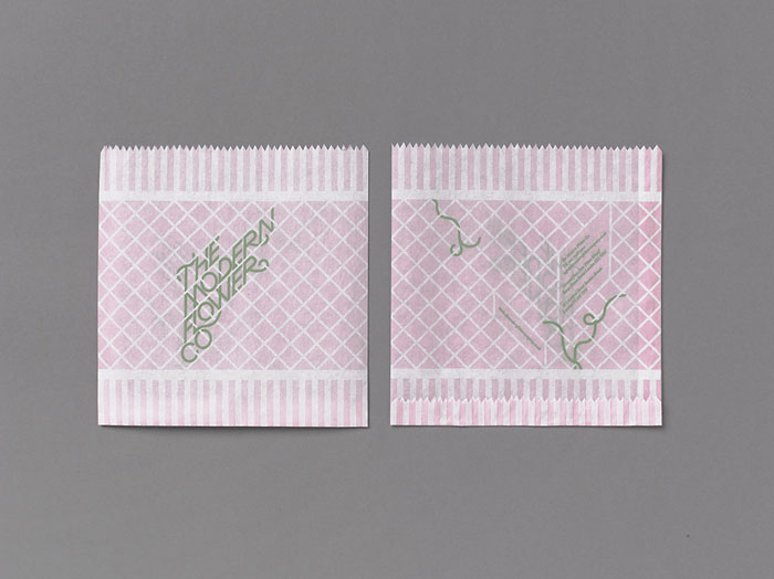
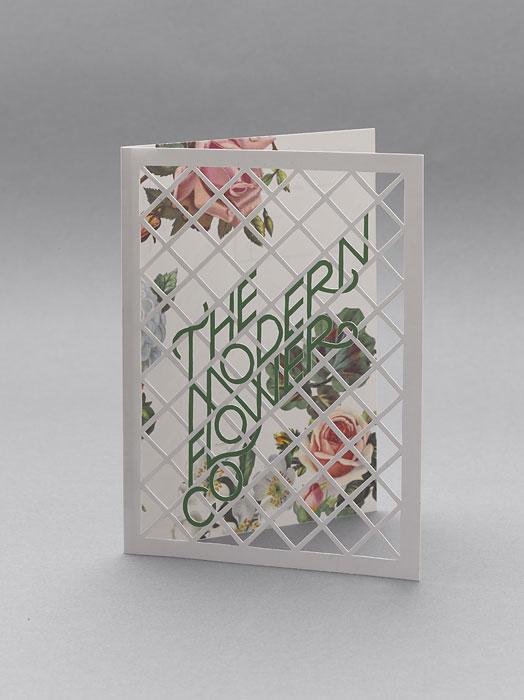
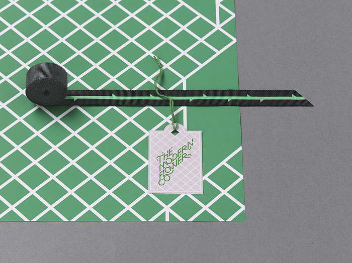
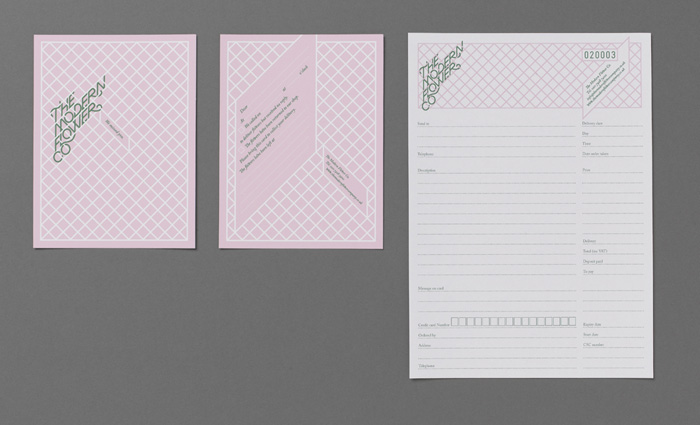
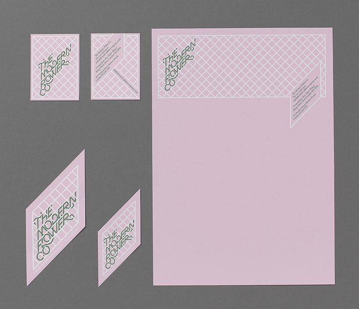
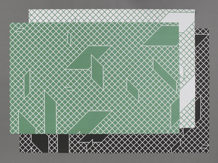
Multistorey were asked to re-brand a (now sadly defunct) London florist. We found something charmingly anachronistic about the word ‘modern’, and felt it would make an interesting starting point — using historical reference points, and exploring what was ‘modern’ to previous generations of florists. In this way, we could avoid producing a modern rebrand that would date very quickly... Using 1950s style white trellis as the structural foundation, we then quite literally grew type around it like vines. We also created windows or shards within the trellis patterns to hold secondary type. The contrasts between sugared almond pink, grass green, and the harder and softer elements of the designs allowed for a treatment that wasn’t overtly feminine, it is men after all who are supposed to be the bigger buyer of flowers. A large suite of stationery was implemented, each item with a specific trellis shape. One of the more interesting pieces is the bespoke carrier bags whose cord handles actually weave in and out of the printed trellis. The wrapping paper is printed with more abstracted patterns, wrapped and tied with ribbon printed with a continuous vine.